Sunday, February 11, 2007

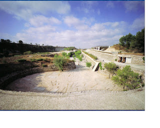
Igualada Cemetary by Enric Miralles & Carme Pinos

The Igualada Cemetary is not a workspace. Neither is it a place for creative professionals, unless the creative professional is dead. I chose to study it for the strategies employed in the reactions to the site.

Anyway, according to Miralles, architecture should relate to the memory of the land. The Igualada Cemetery located on the outskirts of Barcelona attempts to do that.

By sinking the architecture into the ground, the land from above seems virtually untouched. It appears to preserve it original appearance. In addition, the stones from the excavation are reused in the retaining walls.

At the Igualada Cemetery, Miralles’s design is able “to merge with the ground without being subsumed by it; the work is therefore able to exist in its own right, without simply becoming another layer of the land on which it stands

The entrance of the cemetery is marked by “sculptural steel markers”. The chapel is located near the entrance. After the funeral, the mourners join the hearse at the entrance; they then descend into the cemetery. As they progress into the site they find themselves buried by the cemetery, “open space is confronted with closure, as the living are with the dead” However, the cemetery is not only designed for the dead. The path into the cemetery is like a city street with elements that relate directly to human movement such as lights, concrete benches, ramps and stairs.

The materials in the Igualada Cemetery were chosen to show the passing of time.For example, the lamps sheathed in metal will rust with time and the concrete will weather. Furthermore, life is allowed to subtly pervade the territory of the dead, the plants and trees will grow over the years and bury the cemetery. In this project, the dead are not monumentalized, nor are they ignored. The “city of the dead is transformed into a park where the living can also stay awhile”

Basically the cemetary is akin to a "long man-made path", built into the landscape where people (live) experience different spaces and instants while moving through it. While moving through the different spaces one is able to experience the different layers in the architecture.


Nicholas Yeo

Friday, February 9, 2007

German insurance company LVA

The headquarters of German insurance company LVA – a workplace architecture which responds imaginatively to the complex requirements of the client’s brief. Architect Behnisch, Behnisch & Partner faced not just the organizational demands of LVA for a modern workplace but also the planning constraints imposed by the Lubek local authorities to create a building sympathetic to the massing of the medieval town centre.

A dramatic entrance is located at the centre as hub for the workplace. It is here that staff are encouraged to meet informally and to gather for events and functions. This space features a series of converging circulation routes that draw people throught a range of facilities, including a restaurant and library.

Throughout the workplace, smaller ‘centres’ of gravity’ (towards which staff are drawn) have created to allow people to collaborate and dwell in ‘sunspot’ – key open communication areas designed to provide a stimulating atmosphere for shirt, informal meeting. In these sunspots, tea and coffee points, designed as open kitchens with elegant, cafĂ©-life surroundings give views to the landscape outside.


1. Site plan


2. Dramatic central focal point with its converging stairways and circulation routres that pull people together.


3.The building provides a variety of places for people to work, both inside and outside including the gardens and landscapred roof top areas.

4.Converging and crossing circualtion routes and staircases bring people together, creating the opportunity for chance encourters or informal meetings, and fortersing the sense of community.
More can be found on their website:
http://www.behnisch.com/site_files/pdf/15.pdf

-chuan dian-

Thursday, February 1, 2007

On a High

I was looking at serveral precedences and recognised a similarity. Which is the use of very high volume spaces. I am unsure of the pshychological effects of such spaces. But I believe it has something to do with the negative reaction to being in a confined space.

I am also unsure of the reason behind it. Whether such design is deliberate or a result of an existing structure eg. an existing warehouse building or industrial building that was later converted to a studio space.

Personally, I feel working in a double volume environment a lot more comfortable. However, it might take away a bit of the intimacy of the environment. So here are just some pictures of studios which I found with high volume spaces.


Renzo Piano Building Workshop, Genoa, Italy (Image from a+u)


Ingenhoven Architects, Dusseldorf, Germany


Alsop Architects, London, UK


There are many more examples of such spaces being used. Others include Foreign Office Architects (London, UK) and Daniel Libeskind studio which combined different volume heights together for different workspaces, depending on a certain hierachy.

My favourite out of all the examples is the Renzo Piano Buildings workshop (picture above). The space is so full of warmth when bathed in sunlight (then again, this might not be the climatic direction we will want to head towards) But the space looks very inviting compared to the stark white and clinical environments in most other studios.

My favourite image was actually shown to me by Dawn who provided me these images from the a+u magazine. The organisation and the use of the space makes it unlike any regular office with computers everywhere but really reflects the purpose of the space.


Renzo Piano

-andrea